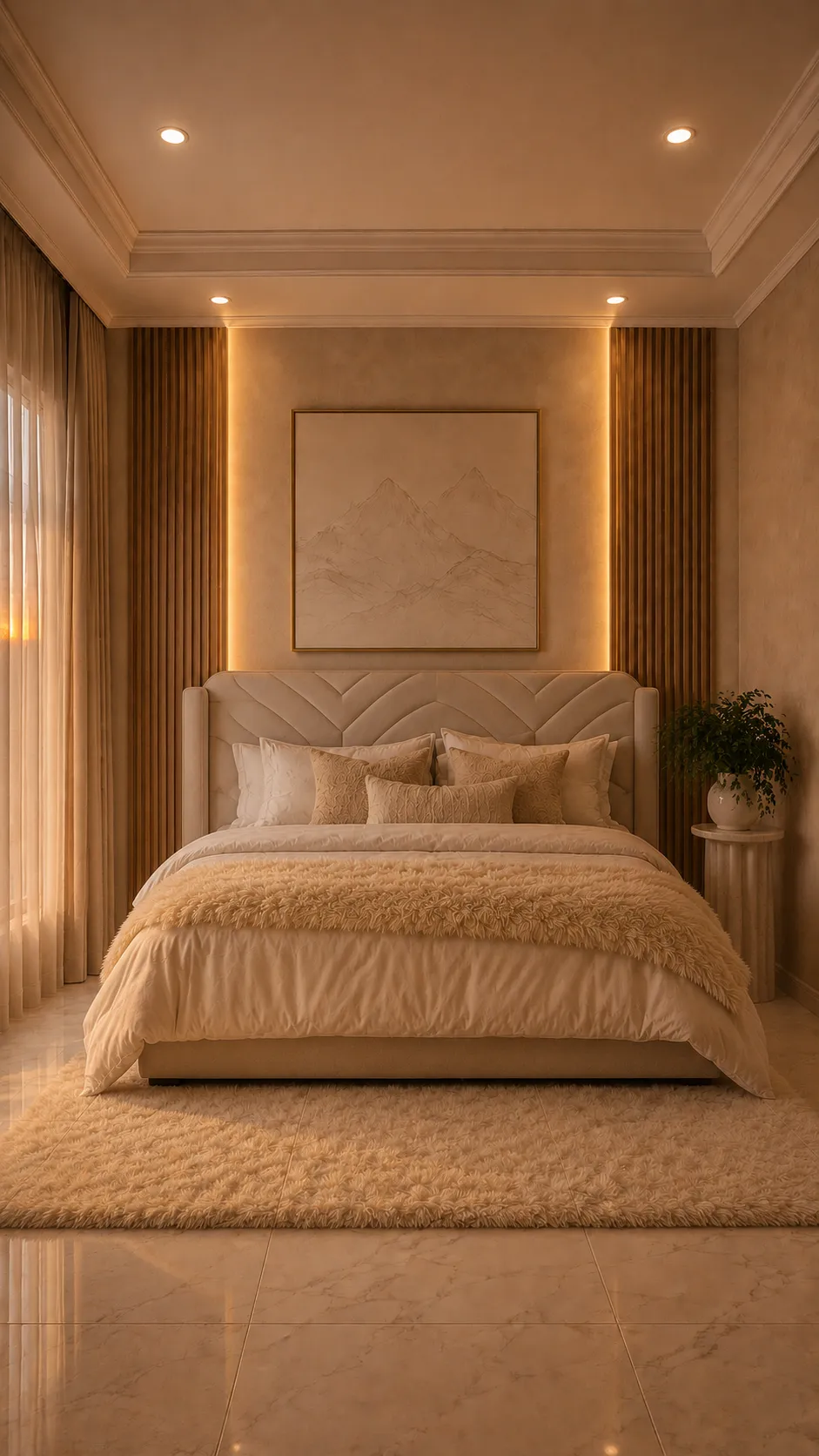
The picture above the bed is almost invisible, and it's there for that reason. In a room where everything is the same cream, what's needed isn't a spot of colour but something with edges: a rectangular piece with a frame a shade darker than the wall, giving the surface a centre and a measure. If that picture had colour, it would become the room's only colour and everything else would have to be built around it.
Items shown are similar to those in the video, not necessarily identical.
A headboard with its pattern formed by diagonal seams rather than buttons, leaving the surface almost flat and far easier to clean than diamond tufting. When choosing, check whether it has side wings, because besides closing the composition they shield you from draughts when reading in bed. Check too whether the cover is removable: in a cream tone that's the difference between being able to wash it and living with the first stain.
See similar on Amazon(paid link)A panel finished in a pale tone at the factory, intended for the side bands of a room where you don't want to introduce the colour of wood. Lacquer has one concrete advantage here over painting a raw panel: the backing between slats is covered evenly, and it's precisely that backing you see lit when the band is backlit. In a pale tone choose a matt finish, because satin returns the glare of the ceiling downlights.
See similar on Amazon(paid link)A high-pile throw to lay across the foot, which on a bed done entirely in one tone is the piece bringing the most visible relief. What to check is the weight rather than just the look: below a certain gram weight the pile flattens with the first wash and the throw ends up a furry fabric with no body. Wash it alone and without softener, because softener mats synthetic fibre and is what kills the volume.
See similar on Amazon(paid link)A minimal line print in the same range as the wall, meant to give a centre without adding colour. When ordering, two decisions matter more than the image: the frame, which should contrast slightly with the wall because it's the only thing defining the rectangle, and the glazing, which wants to be anti-reflective or absent altogether, since such a pale drawing disappears under the reflection of a window or a ceiling spot.
See similar on Amazon(paid link)A cylindrical table with a fluted shaft, in reconstituted stone or glass fibre imitating it. Having no corners it's the piece that works best in the narrow gap between bed and wall, where a rectangular table gets knocked as you pass. Check the weight before buying: solid stone ones don't move for cleaning underneath, and resin ones weigh little but tip easily if you lean something on the edge.
See similar on Amazon(paid link)Some links on this page are affiliate links. If you make a purchase through them, we may earn a commission at no extra cost to you.
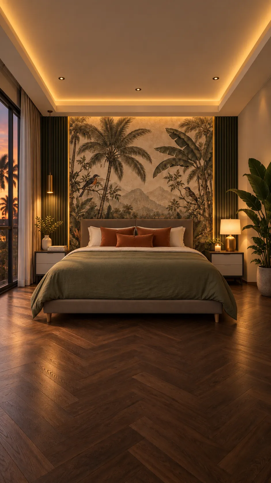 Bedroom
Colonial Tropical
The thing that took most work in this room is the floor and it barely gets looked at: herringbone…
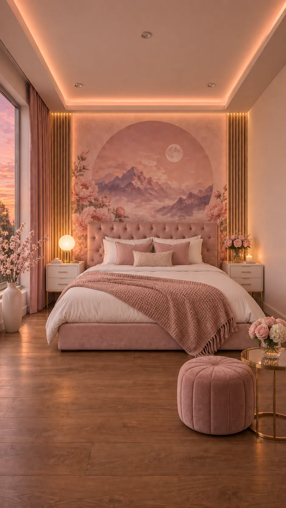 Bedroom
Clásico Rosado
A mural cut as a circle doesn't work like a rectangular one, and the difference isn't shape but…
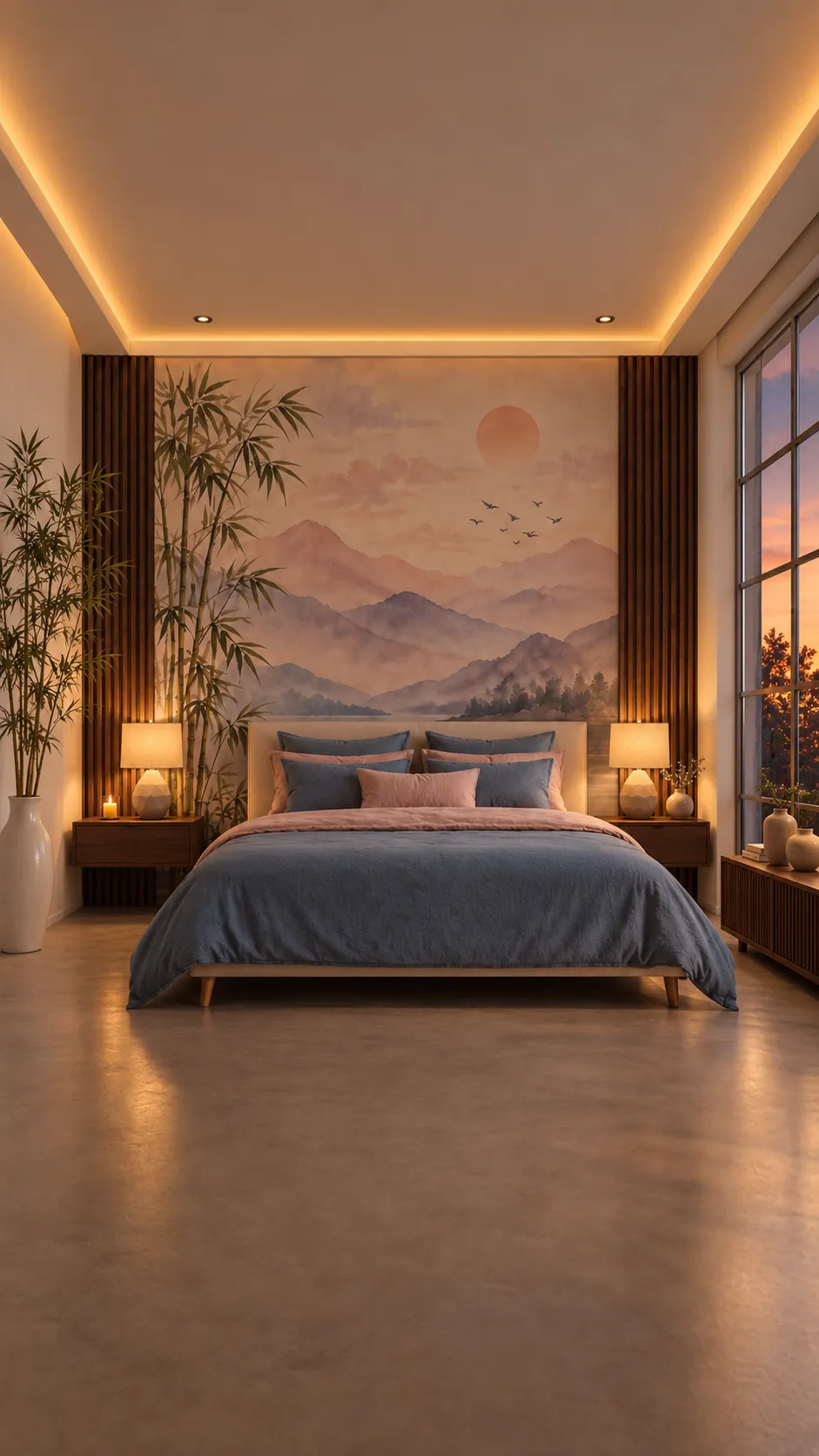 Bedroom
Minimalista Natural
The mural is pink and the bed is blue, and that's the decision holding the room together. The…
 Tu Casa