✨Interior images are AI-generated. Items shown are similar to those in the video.
Elegante Terroso
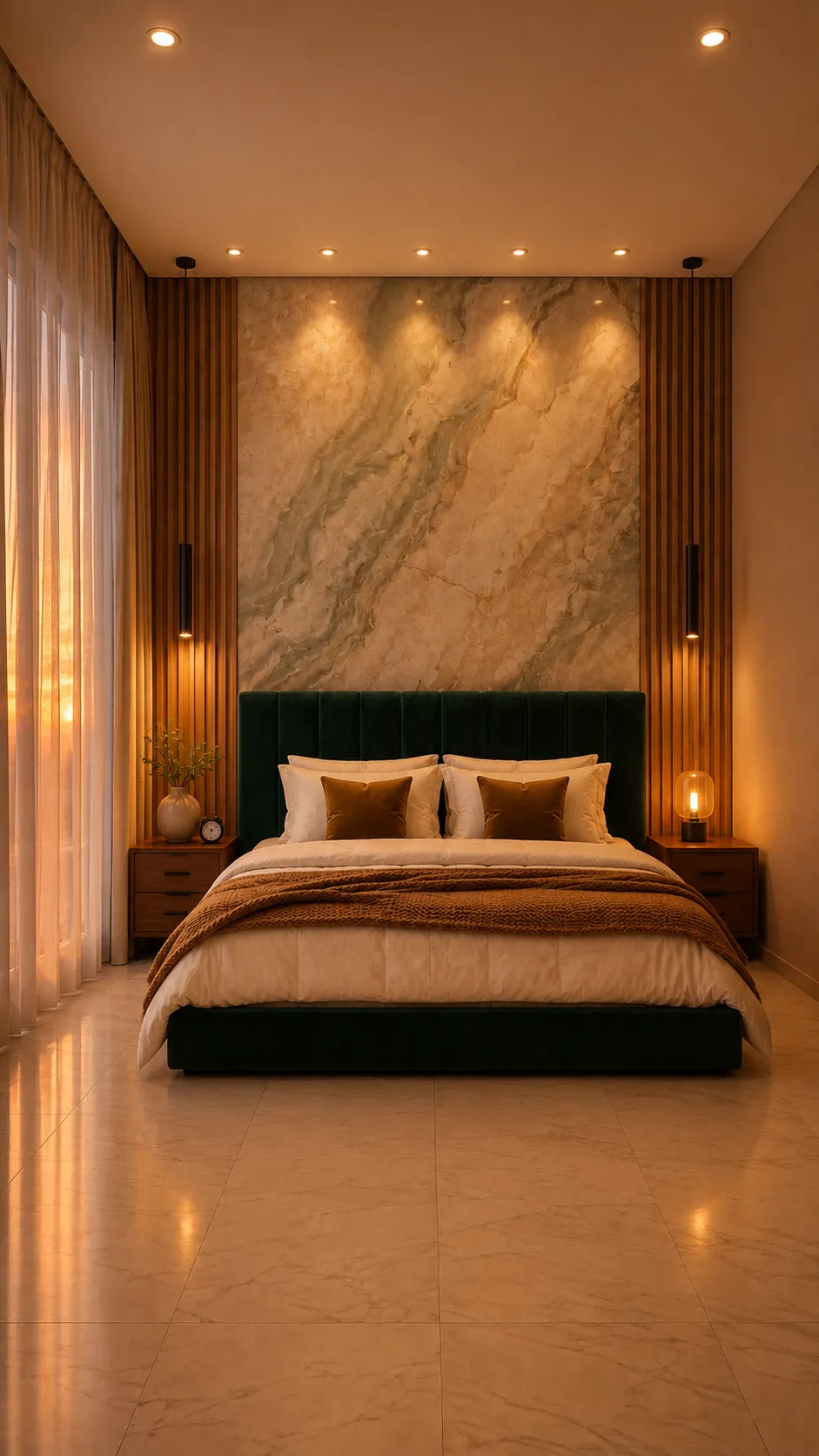
Bedroom with a stone slab washed by spotlights and a green headboard
On this wall you see six separate pools of light rather than an even wash, and it's worth knowing that isn't a fitting error but what a spotlight does when used to light a vertical surface. There are two routes: change the type of fitting so the stone is washed top to bottom, or accept the scalloping and place it deliberately. With a figured slab, the second makes more sense than it sounds.
Losa de piedraBañador de paredFestoneado de luzPanel de listonesCabecero canaladoTerciopelo verdeMostazaEncuentro de materialesColgante estrechoDormitorio
Design keys
A pale stone slab with greenish veining on the diagonal, occupying only the central width of the wall.
Six recessed spots aimed at the slab, leaving separate pools of light instead of a continuous wash.
Honey timber slat panels on both sides, thicker than the slab and resolved with a profile at the junction.
A channelled headboard in bottle green, the only saturated colour and also wider than the slab itself.
Very narrow, long cylindrical pendants, hung in front of the slatting rather than over the nightstands.
Mustard repeated only in two cushions and the throw, over an entirely cream base.
Furniture and decor in this design
5
Items shown are similar to those in the video, not necessarily identical.
Recessed wall washer
A ceiling fitting with asymmetric optics, designed to wash a vertical surface top to bottom rather than leave an oval of light. It's what separates lighting a wall from aiming a spot at it. In the spec, check the recommended mounting distance from the wall, usually around a third of the ceiling height, and the beam: the closer it sits to the face, the wider the optic needs to be so the top edge doesn't show.
Transition profile for materials of different thickness
An L or U profile closing the edge where a slat panel meets a thinner slab, resolving the step between the two planes. It's ordered by the size of that step, so add up the panel's real thickness including battens first, which is considerably more than the panel's own spec sheet states. In anodised aluminium or lacquered to the timber's tone it disappears; in a polished finish it reads as a line and is only worth it if you want the joint marked.
A wide-cable throw to lay across the foot of the bed, in the tone that appears here only in two more cushions. It's the piece that brings relief to an otherwise flat bed, and it wants to be an open knit rather than a flat weave: what you see from the doorway is the shadow each cable casts. Check the composition, because cheap acrylic mats after two washes and loses exactly the volume you bought it for.
A small dial clock for the nightstand, solving the problem of checking the time at night without waking a phone. For a bedroom one spec matters more than the design: that the movement is silent, the so-called continuous sweep type, because a ticking second hand is perfectly audible in a quiet room and is among the things that most disturb sleep. Pale dials with luminous markers can be read at night without any light.
Large-format tile with a polished finish, the one that returns the reflection of the headboard and lamps and makes a room look larger than it is. It has two drawbacks worth knowing first: it's more slippery than a matt finish, especially with wet feet, so it isn't the choice for a bathroom; and it shows every footprint and speck of dust, meaning frequent mopping with a wax-free product to avoid leaving a film.
If you want the stone evenly washed, a spotlight won't do it: you need a wall washer, which has asymmetric optics designed to spread the beam vertically. An ordinary adjustable spot, however much you angle it, projects a cone and leaves a defined edge.
With spotlights, the spacing between them should resemble their distance from the wall. Set every half metre at twenty centimetres off the face, the scalloping is pronounced; moving them back and spacing them to match, the cones overlap and the pattern softens.
Think through the junction between slab and slatting before ordering anything. Six-millimetre porcelain and a twenty-five-millimetre slat panel aren't in the same plane, and that difference has to be resolved with a profile or a setback, not left exposed as a step.
On polished stone, the more grazing the light, the more the fittings themselves reflect in the surface. If the slab is glossy and the spots sit close to the face, from the bed you see the light points repeated in the reflection: moving them back a hand's width changes the result considerably.
The headboard can be wider than the slab, but then it has to run over the slatting rather than stopping halfway. Upholstery that ends exactly where the side panel begins leaves a junction line at pillow height that's visible from the doorway.
FAQ
Why do you see separate pools of light when lighting a wall with spots?
Because a spotlight projects a cone, and a cone against a vertical surface draws an oval with a defined edge. Put several in a row and what you get are ovals separated by darker zones, an effect lighting people call scalloping. It isn't an installation fault but the normal behaviour of that fitting. To avoid it there's the wall washer, which carries a lens or asymmetric reflector designed to throw more light to the lower part of the wall and achieve an even result from ceiling to floor. If the spots are already in, what helps most is moving them away from the wall: the greater the distance, the more the cones open and overlap. That said, on heavily figured stone the scalloping doesn't always bother, because the veining already breaks the surface and completely flat light can leave it without relief.
How do you resolve the junction between a slat panel and a stone slab?
By accepting first that they won't finish level. A porcelain slab is around six millimetres and natural stone around twenty, while a slat panel with its backing and battens easily reaches thirty or forty, so the slatting always stands proud. There are three ways round it. The cleanest is setting the slab back, letting the timber panel act as a frame with the stone recessed a few centimetres, which is how it is here. The second is levelling the planes by backing the slab with board until it matches the panel's thickness. And the third, once everything is up, is closing the joint with an L or U profile in the timber's tone. What doesn't work is leaving the panel's edge exposed against the stone, because the board's core shows and gives the build away.
Should the headboard be wider or narrower than the wall panel?
Either works; what doesn't work is them almost matching. If the upholstery is narrower, the slab shows fully at the sides and the headboard reads as a piece set in front of it. If it's wider, as in this room, the headboard runs over the side panels and becomes the element organising the wall, with the stone appearing only above. Both readings are valid and you choose by deciding what should govern. The problem arises when the headboard width lands two or three centimetres off the slab's edge: then you can't tell whether it's aligned or out of true, and the eye reads it as a mistake. In doubt, exaggerating the difference one way or the other always works out better than getting close.
Some links on this page are affiliate links. If you make a purchase through them, we may earn a commission at no extra cost to you.
 Bedroom
 Bedroom
 Bedroom
 Tu Casa